In today’s mobile-first world, having a responsive WordPress website is no longer optional; it is an obligation. A responsive website automatically changes its layout and content to best fit any screen size, ensuring that your visitor’s experience on your site is smooth and enjoyable-be it on desktops, laptops, tablets, or smartphones. This guide will walk you through the major steps to create a fully responsive WordPress website that looks great and functions flawlessly on every device.
Table of Contents
ToggleWhy Responsive WordPress Matters
But before we dig into “how,” let’s understand the “why.” Here is why responsive WordPress matters:
Improved User Experience:
The responsive WordPress design ensures visitors can easily navigate your site, read your content, and interact with your calls to action no matter which device they may come from. This turns into higher engagement, lesser bounce rate, and users who remain happy.
SEO Benefits:
Google gives preference to mobile-friendly websites in its search results. A responsive WordPress site will greatly improve your search engine rankings, driving more organic traffic to your site.
Increased Conversions:
Once your website is accessible and easy to use on any device, conversions from your visitors to customers are guaranteed, whether it is to make a purchase, sign up for a newsletter, or even contact you for more information.
Future-Proofing Your Website:
With the increasing number of mobile devices and different screen sizes, a responsive WordPress website secures the future of your online existence.
How to Create a Responsive WordPress Website
Next, let’s go into the nitty-gritty details of how to construct a responsive WordPress site:
1. Choose a Responsive WordPress Theme
A responsive WordPress website all begins with a responsive theme. A theme is what governs how your site looks and its layout. In choosing a theme, use the search terms “responsive” or “mobile-friendly.”
Some of the high-in-demand options include the following:
- Astra: A light, super flexible theme with superior performance with a responsive design.
- OceanWP: A fast, fully customizable theme that comes with many demos for different purposes and is fully responsive to any WordPress website niche.
- GeneratePress: Another very lightweight and fast theme focused on responsive design and accessibility.
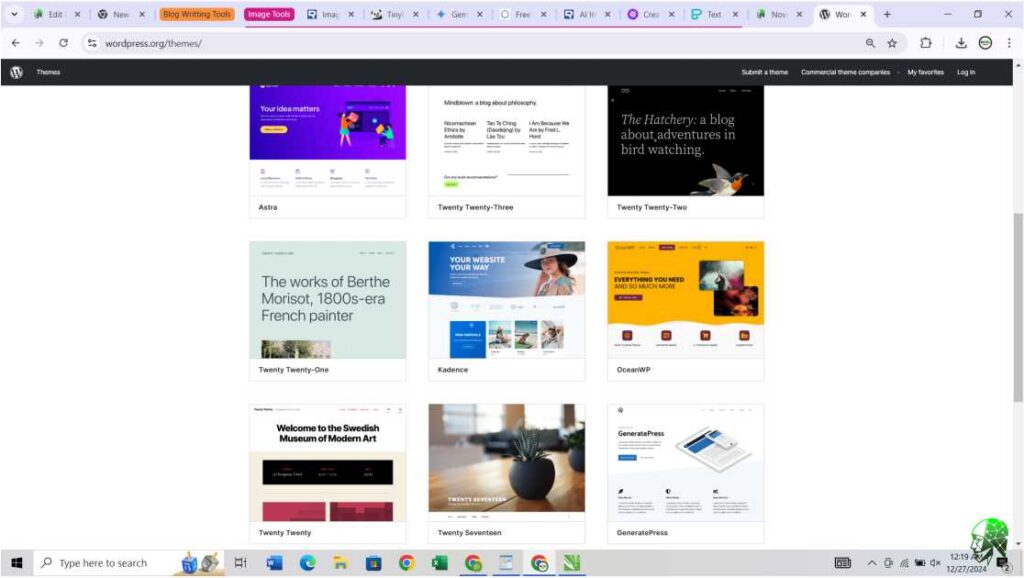
You can find a lot of free and premium responsive themes in the WordPress Theme Directory.
2. Responsive Plugins Utilize
Plugins extend the functionality of your responsive WordPress website. While many themes come with built-in responsive features, some plugins can add more to make your website friendly for mobile users.
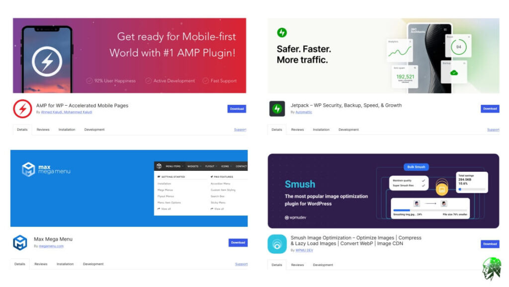
- WPtouch: This plugin automatically adds a mobile-friendly version of your website for visitors accessing your site from smartphones.
- Responsive Menu: Create user-friendly navigation menus that adapt seamlessly to different screen sizes.
- Smush: Optimize your images for faster loading times, which is crucial for a smooth mobile experience.
3. Harness the Power of Page Builders

Page builders give you a visual, drag-and-drop interface to design your website. I over-recommend Elementor Page Builder for this. They offer powerful responsive design controls, enabling you to customize how your content appears on different devices.
- Responsive Editing: Elementor allows toggling between desktop, tablet, and mobile views from within the editor. This way, you see how your design is really going to appear on every screen device and perform the desired edit.
- Column Control: You’re able to edit the column count, or even disable columns completely in different devices. Probably in most situations, that could mean something with a three-column format on larger screens that displays as only one column on mobile devices.
- Element Hiding: This shows or conceals certain elements on devices. That is helpful to declutter the mobile view by setting less important elements to be hidden.
- Mobile-Specific Styling: Adjust font sizes, spacing, and other design elements for mobile with precision to make sure the text and elements are easily readable and work well on mobile.
Harnessing responsive controls in Elementor or any other page builder will lead you to pixel-perfect designs that would adapt seamlessly to any screen.
4. Your Content Should Be Responsive Too
While a responsive theme and plugins provide the framework, your content also needs to be optimized for different devices.
- Use Clear and Concise Language: Generally speaking, the attention span of mobile users is less than that of desktop users. Keep your content concise and to the point.
- Structure Your Content with Headings: Divide long blocks of text with headings and subheadings to enhance readability on small screens.
- Optimize Images: Use appropriately sized images and compress them to reduce loading times.
5. Test Your Website on Different Devices
The final step is testing your responsive WordPress website on actual physical devices. First, test your site using actual physical devices such as your phone, tablet, and laptop along with browser developer tools.
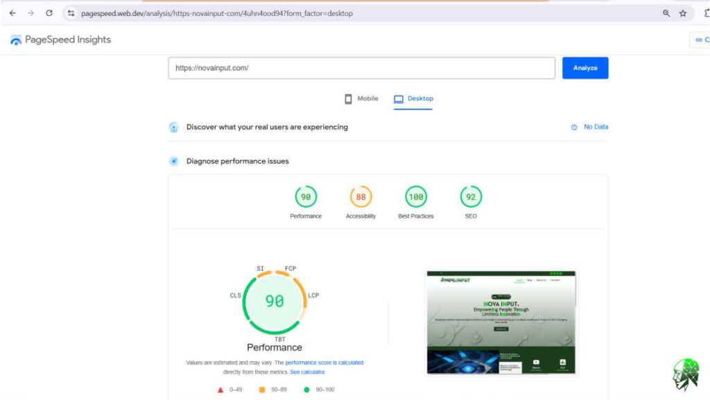
You can use PageSpeed Insights (PSI), a free tool from Google that analyzes the performance of a web page on both mobile and desktop devices.
Responsive design is important for user experience, SEO, and conversion rates. Take a responsive theme as the backbone of your website. Leverage plugins that enhance mobile functionality. Ensure your content is optimized to be readable on small-screen devices. Check responsiveness of your website on various devices.
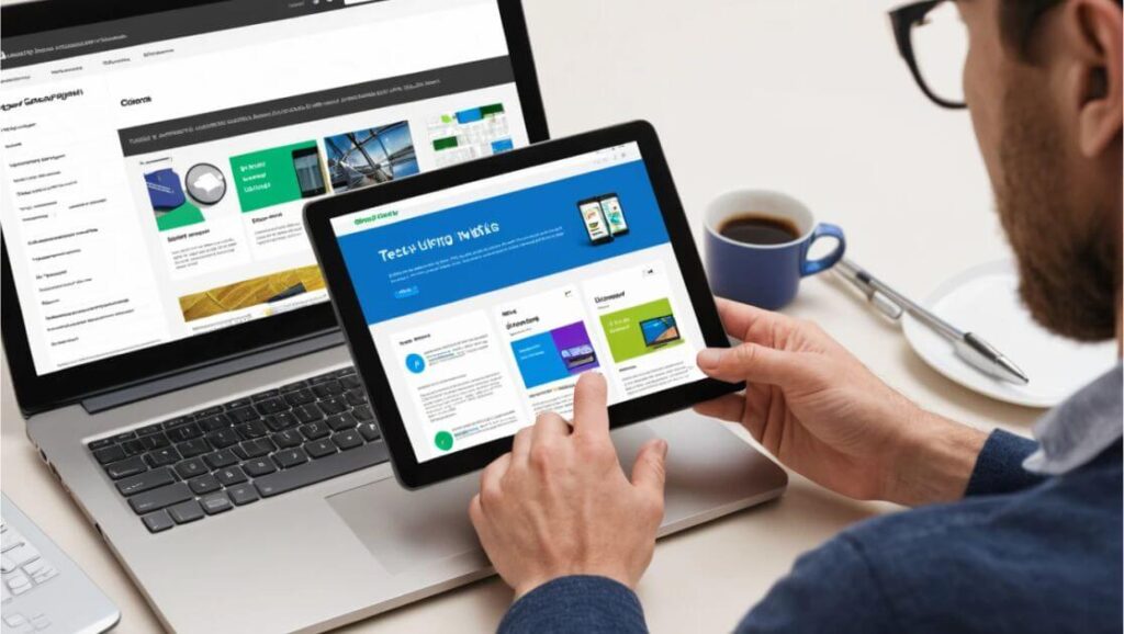
By following these steps, you can create a responsive WordPress website that truly engages your audience, is well-ranked in search results, and drives business success.


